Event Site Maps Visitors Will Actually Use
How to make an event or festival site map people use: what to mark, which audiences to serve, why printed maps fail by the first morning, how to update the map during the event, and how to put it on tickets, wristbands and signs.
 360 Virtual Tours · Updated 2026
The printed site map is finished the day the layout is signed off and wrong by the first morning: a stage moves, a gate floods, the overflow car park opens, the ice cream van parks where the first-aid tent was going to be. Visitors learn quickly that the map on the back of the programme is a souvenir, and go back to asking stewards. A live map on their phone fixes that, if it is made for the way people actually move around an event. Here is what we have learned building the events template in Signposted.
Mark what people look for, not what you built
Organisers map the things that took effort: stages, arenas, the main bar. Visitors look for the things that solve a problem: the nearest toilet, water, cash, the first-aid tent, the lost-children point, the gate they came in by, their car. Put both on the map, and make the practical ones one tap away with a filter. Opening hours on each place matter more than descriptions: when the food court closes is a fact, how good the burgers are is not.
Serve three audiences
A visitor, an exhibitor and a disabled visitor need different maps of the same field. The exhibitor wants the service road, the build-up window, the trader car park and a phone number. The disabled visitor wants the blue-badge parking, the step-free route, the viewing platform and the accessible toilets, without wading through the rest. Give each a version of the page with their own to-do list: pass collected, vehicle registered, access wristband picked up. It costs nothing extra and it removes a stream of radio calls.
Satellite view, not a drawing
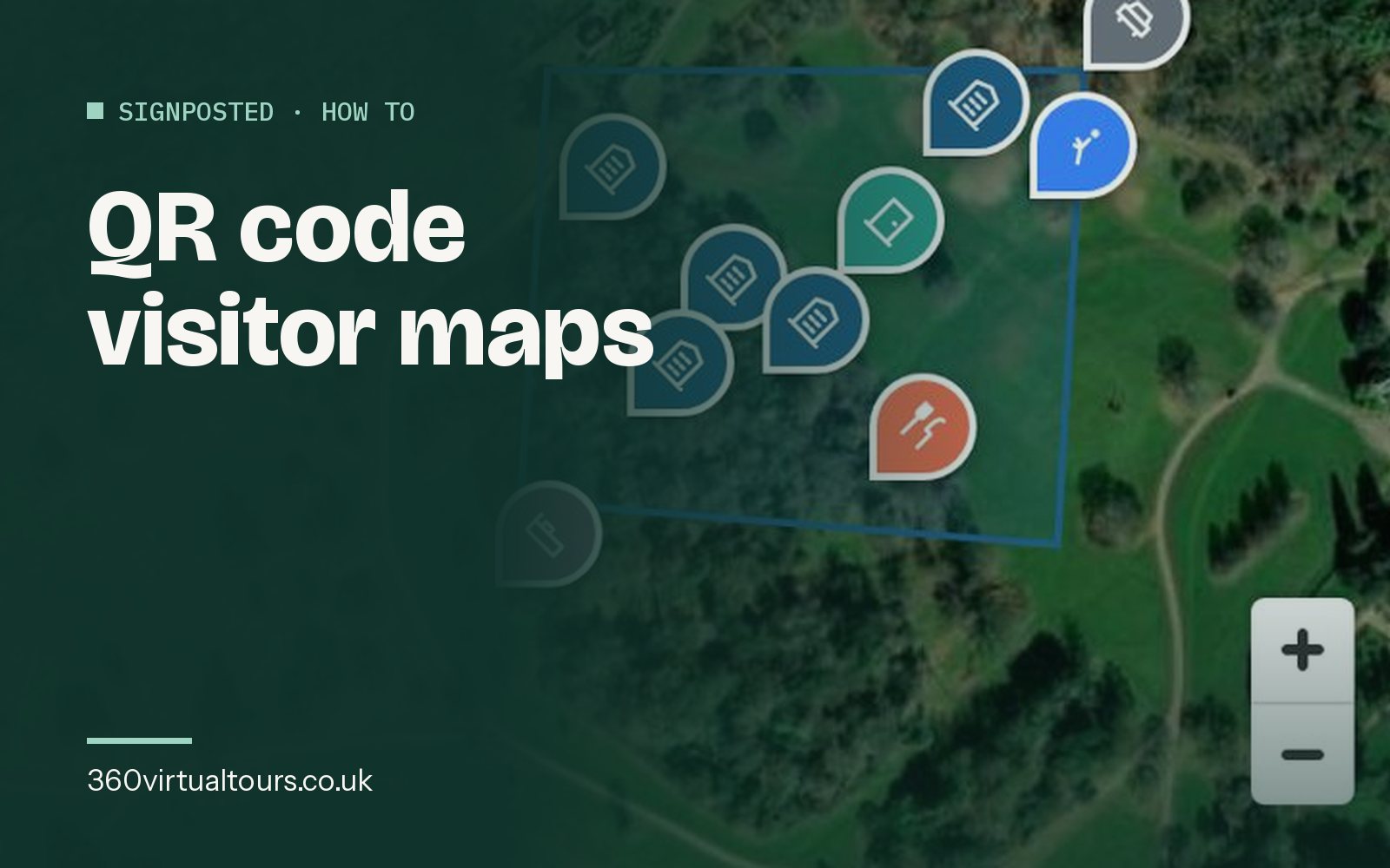
A field with marquees on it is unrecognisable on a line drawing and obvious on satellite imagery. Draw the arena, the camping fields and the car parks as shaded areas on the real view, drop pins for everything else, and visitors orient themselves by the hedges and the tree line, which is what they can actually see.
Directions from where they are standing
The feature that makes a phone map better than a sign is the blue dot. Every place should offer a walking route from the visitor's current position, or, if they have not shared their location, from the gate you told them to use. "Twelve minutes to the car park" settles arguments.
Change it during the event
The whole value of a live map is that someone with a phone can change it. A gate closed, a car park full, a stage running forty minutes late: edit, publish, and the next person to open the page sees it. Keep the address and the QR code the same all weekend, and the same from year to year, so the printed signs still work and last year's visitors have it bookmarked.
Where to put the code
Tickets and wristbands go everywhere the visitor goes, so they are the best placement. After that, the car parks and gates, the information point, and every toilet block, because that is where people stand still and look at their phones. Our QR code guide covers sizing and wording.
Afterwards
A phone map tells you what a paper one never could: which places people looked for, which they could not find, which gate most used. Point it at your own Google Analytics and next year's layout starts from evidence.
Ready to talk about a tour?
Bespoke 360, Matterport 3D or Google Street View: tell us about the space and we will recommend the right format and give you a clear price.